

2020
(Summary)
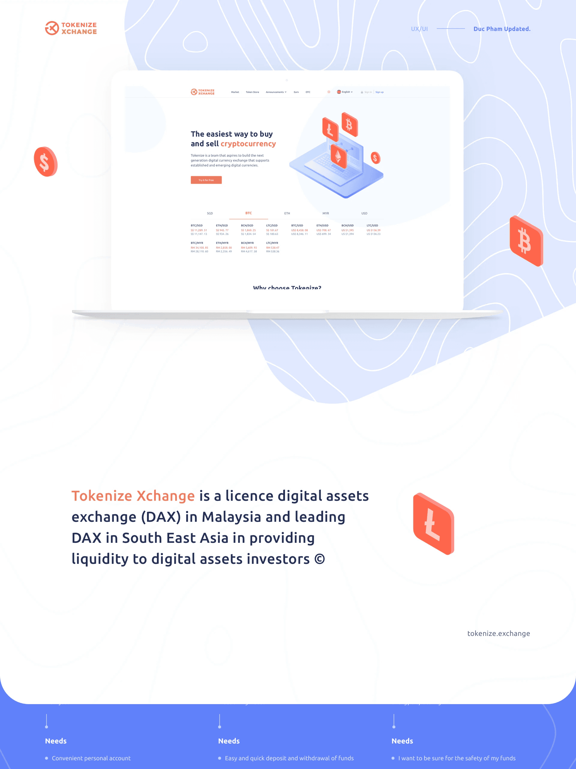
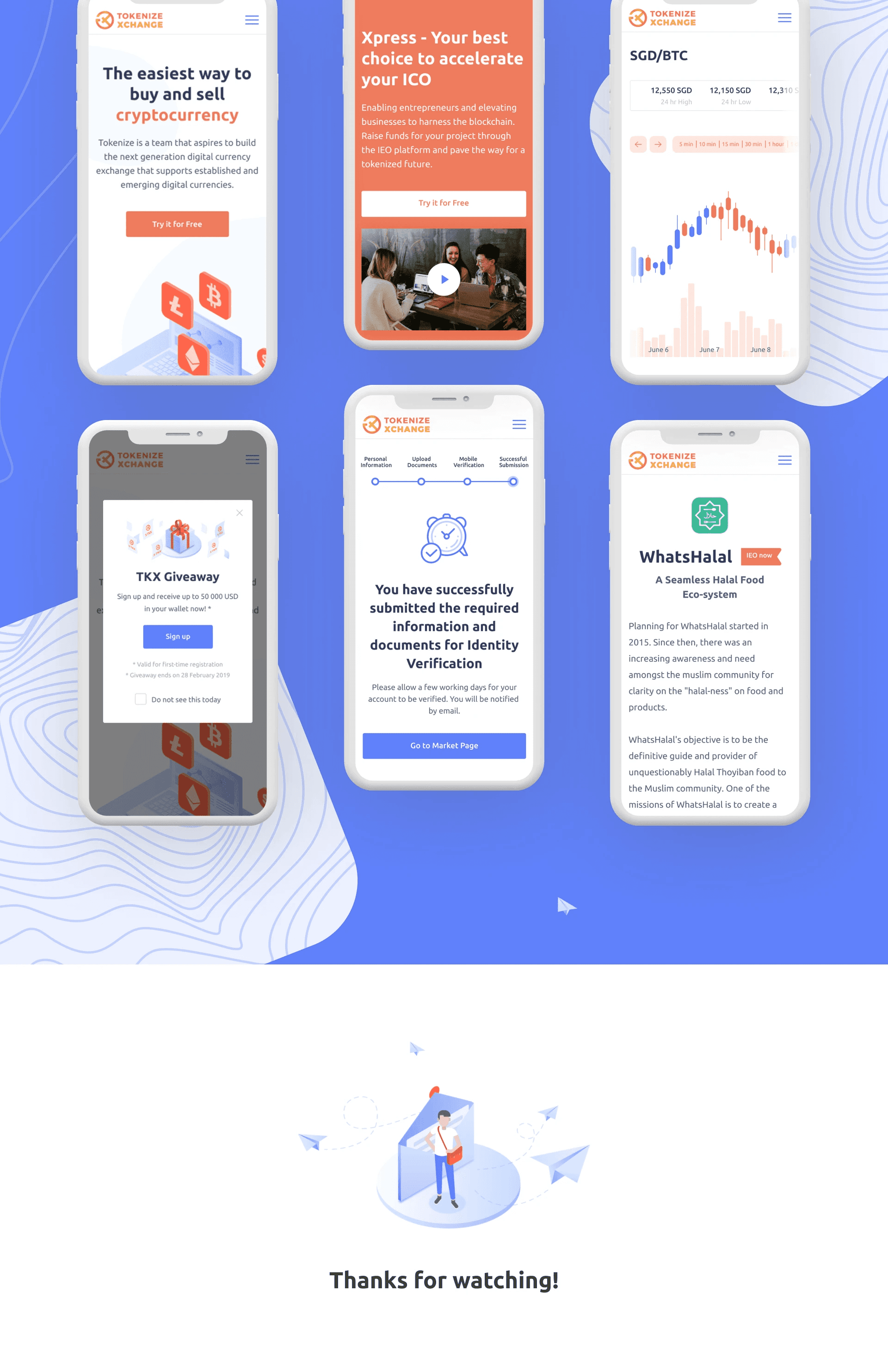
Tokenize Exchange is a regulated Singapore-based crypto trading platform for tokenized assets — stocks, commodities, and cryptocurrencies represented as digital tokens on a blockchain. I led the full UX redesign of the web platform, replacing a cluttered, hard-to-navigate interface with a trust-first trading experience built around clarity, progressive onboarding, and user confidence at the moment of trade

Tokenize Technology Pte. Ltd.
Singapore
Tokenize Technology Pte. Ltd. is a Singapore-based fintech company operating Tokenize Exchange, a regulated digital asset trading platform.
(Problem Framing)
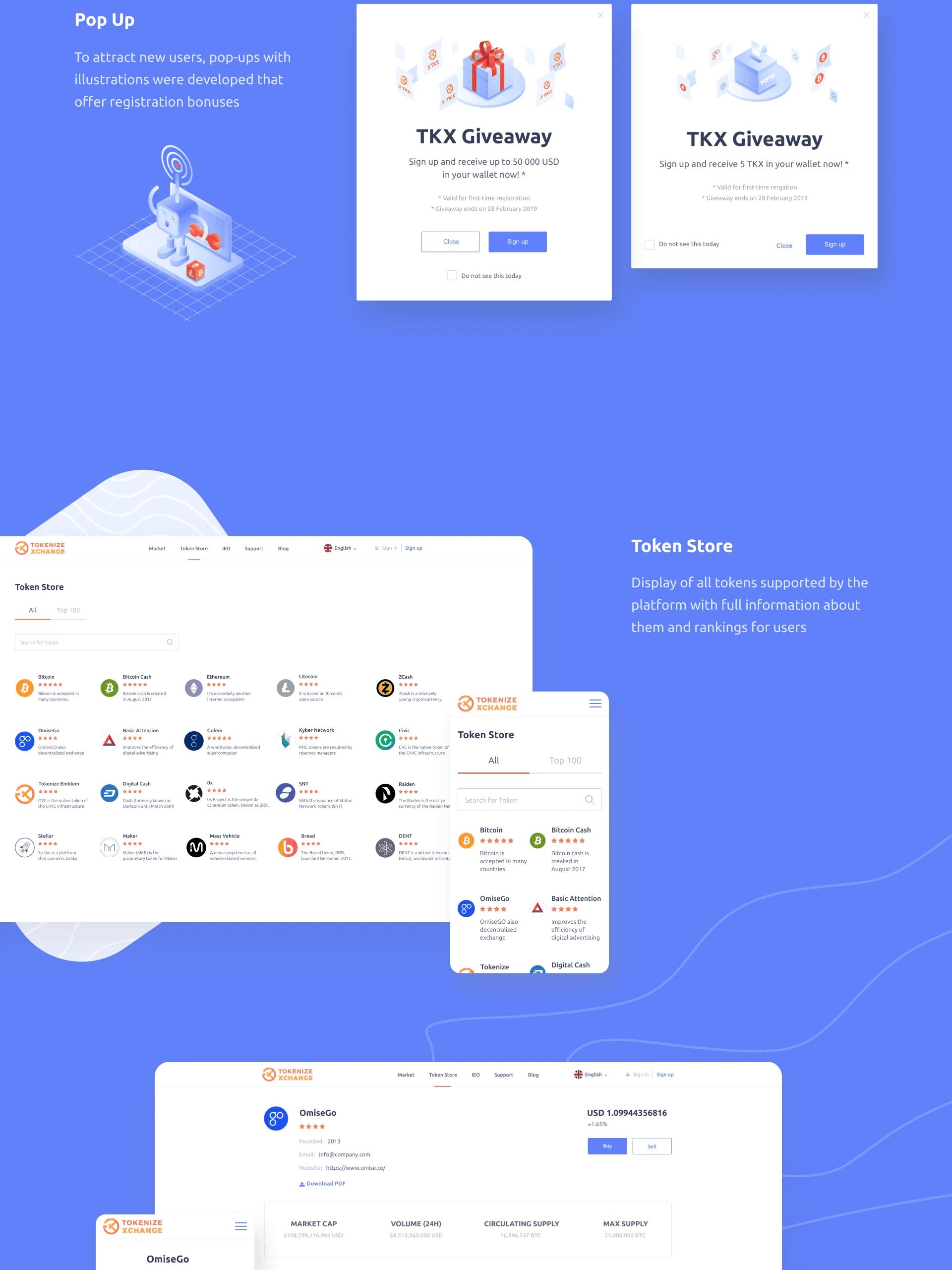
Users were bouncing before they ever made a trade
The original platform had accumulated complexity over time — features added without a coherent information architecture, navigation that assumed expert knowledge, and a visual design that communicated neither trust nor clarity. New users in particular were struggling to orient themselves. Key problems identified through research:
Navigation was non-intuitive — users couldn't locate core actions like placing a trade or checking their portfolio without multiple clicks
Onboarding dropped users into a complex dashboard with no guidance — new users felt immediately overwhelmed
Performance issues compounded UX problems — slow load times and delayed feedback made an already confusing experience feel unreliable
No educational layer — the platform assumed trading knowledge that many users didn't have, creating a high barrier to first trade
(Role & Team)
What I owned
I was the UI/UX designer on this project, working alongside a product manager and engineering team. My responsibilities covered the full design process:
User research — interviews + competitive analysis to identify usability gaps and unmet needs
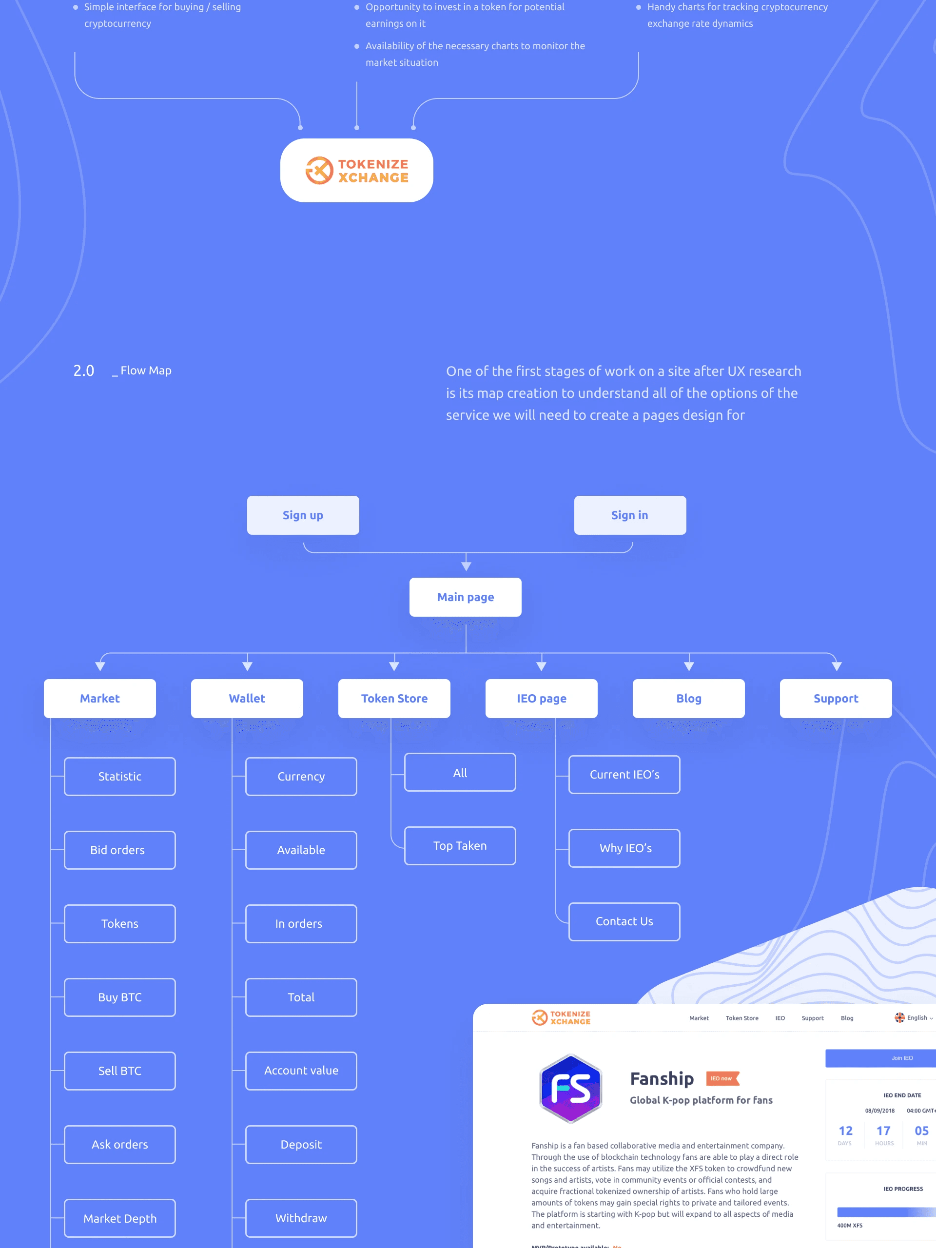
Information architecture — restructuring the full navigation and content hierarchy
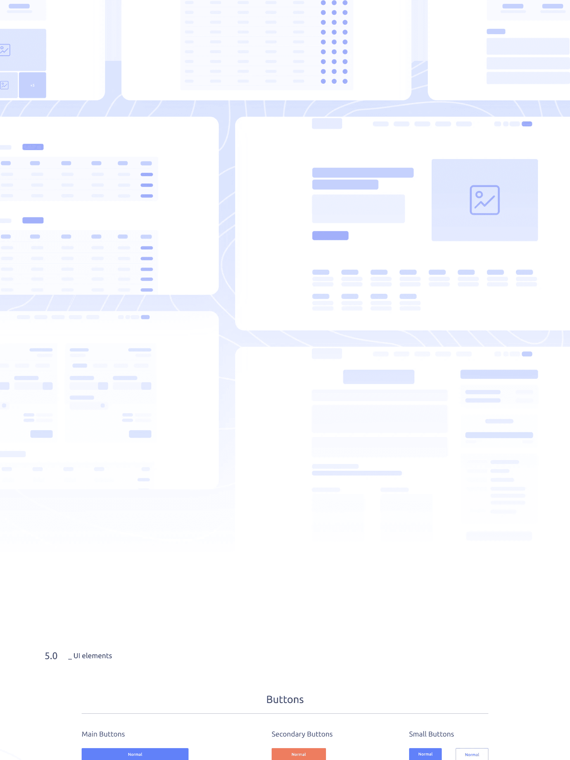
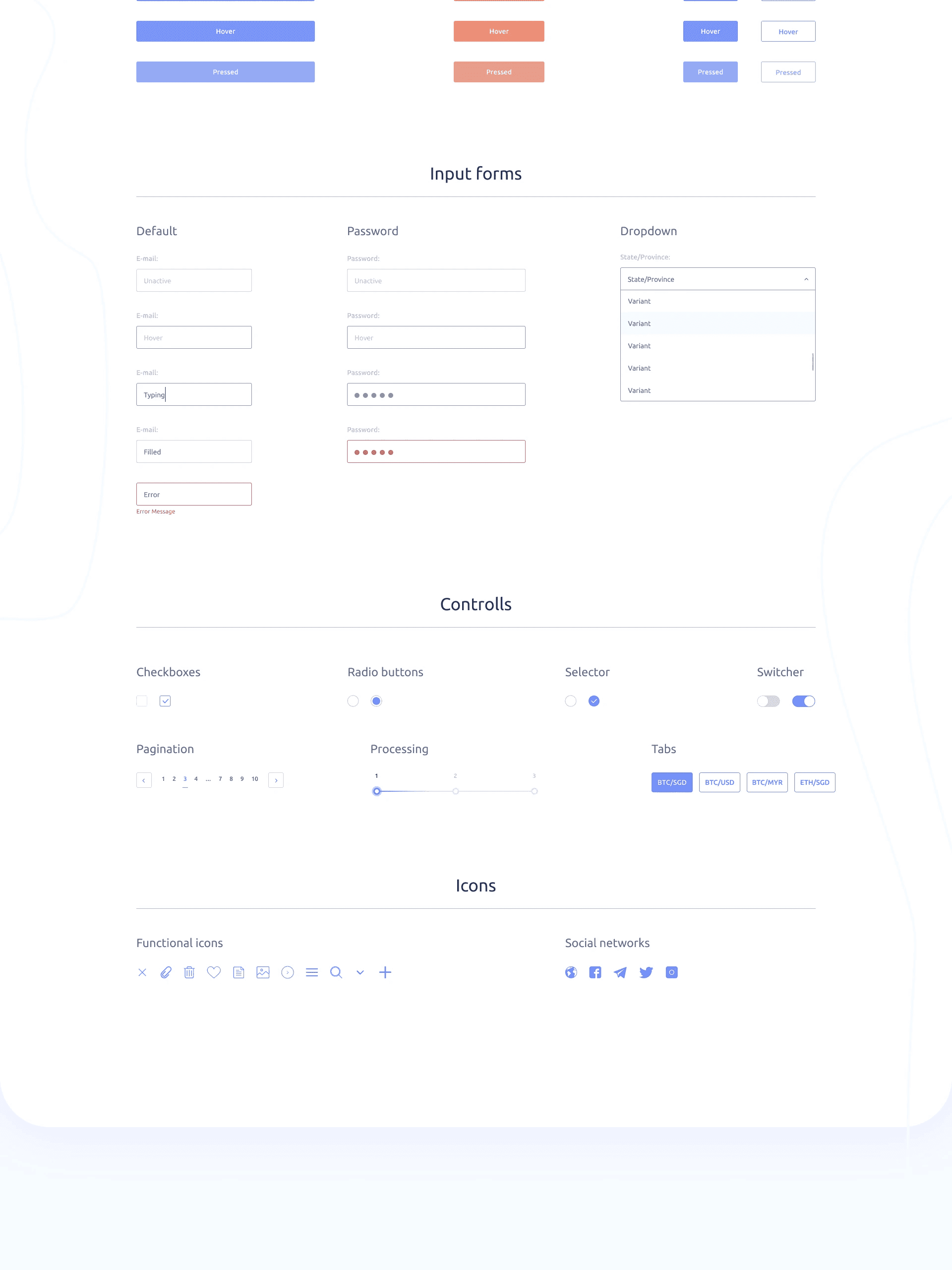
Wireframes and interaction design — from low-fidelity explorations to high-fidelity interactive prototypes
Usability testing — recruiting representative users and running moderated test sessions
Design handoff — working with engineering on implementation and reviewing builds against design intent
(Approach)
Research first. Iterate fast. Test everything.
I started with a research sprint: competitive analysis of leading crypto trading platforms (Binance, Coinbase, Kraken) to understand industry conventions and identify where Tokenize could differentiate. Combined with user interviews across novice and experienced traders, this produced a clear hierarchy of problems to solve.
Rather than redesigning everything at once, I structured the work around the core user journey: first-time visit → sign-up → dashboard → first trade → portfolio management. Fixing this end-to-end arc took priority over polishing individual screens.
(Challenges)
Designing for two very different users at once
Crypto trading platforms serve a wide spectrum — from first-time investors who've never bought a token, to professional traders executing dozens of orders a day. These two groups have almost opposite needs: beginners need guidance and simplicity; experts need speed and data density.
Finding the design approach that served both — without watering down the experience for experts or overwhelming beginners — required multiple rounds of prototype testing and careful use of progressive disclosure to show complexity only when users were ready for it.
(Solutions)
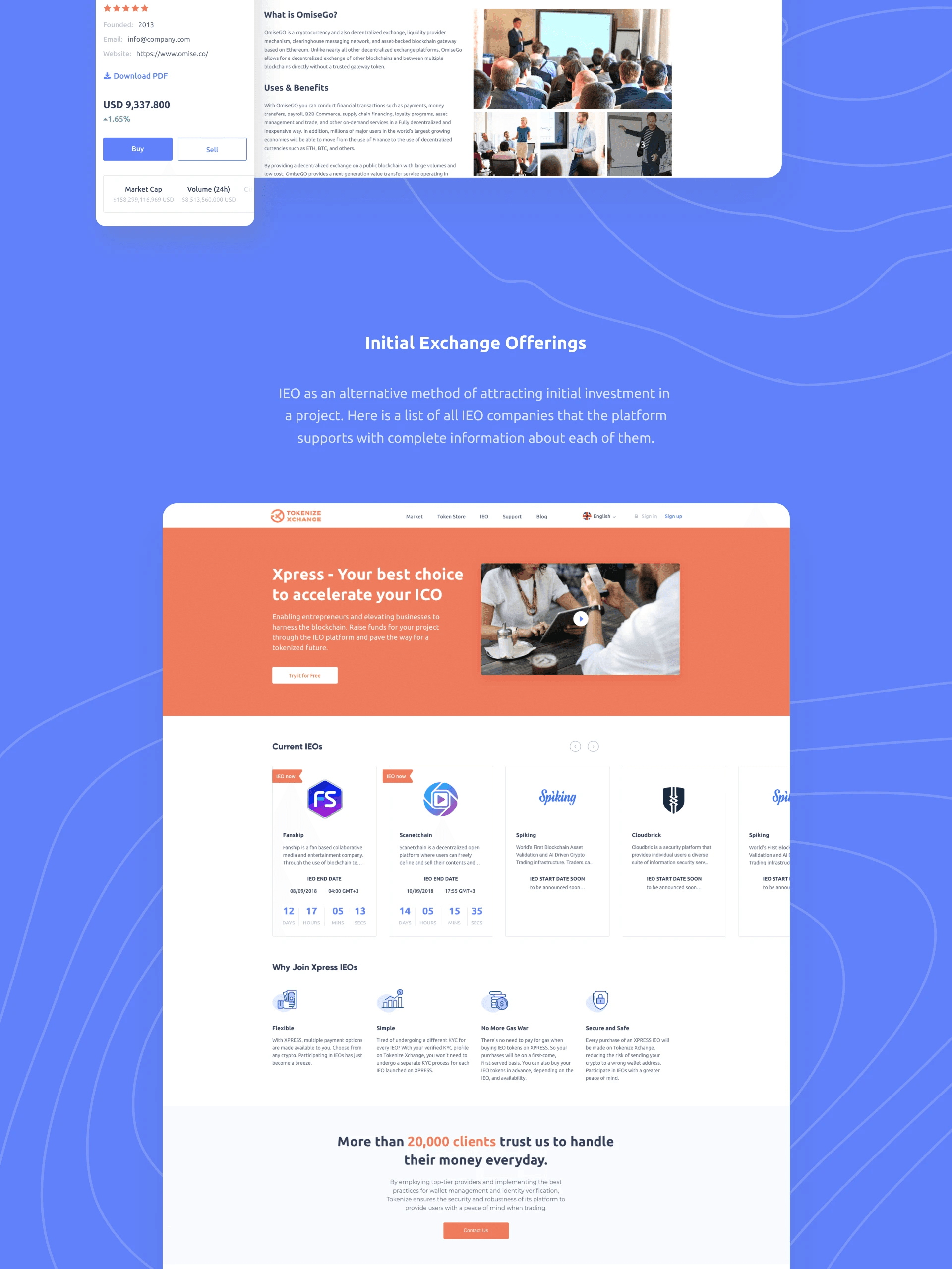
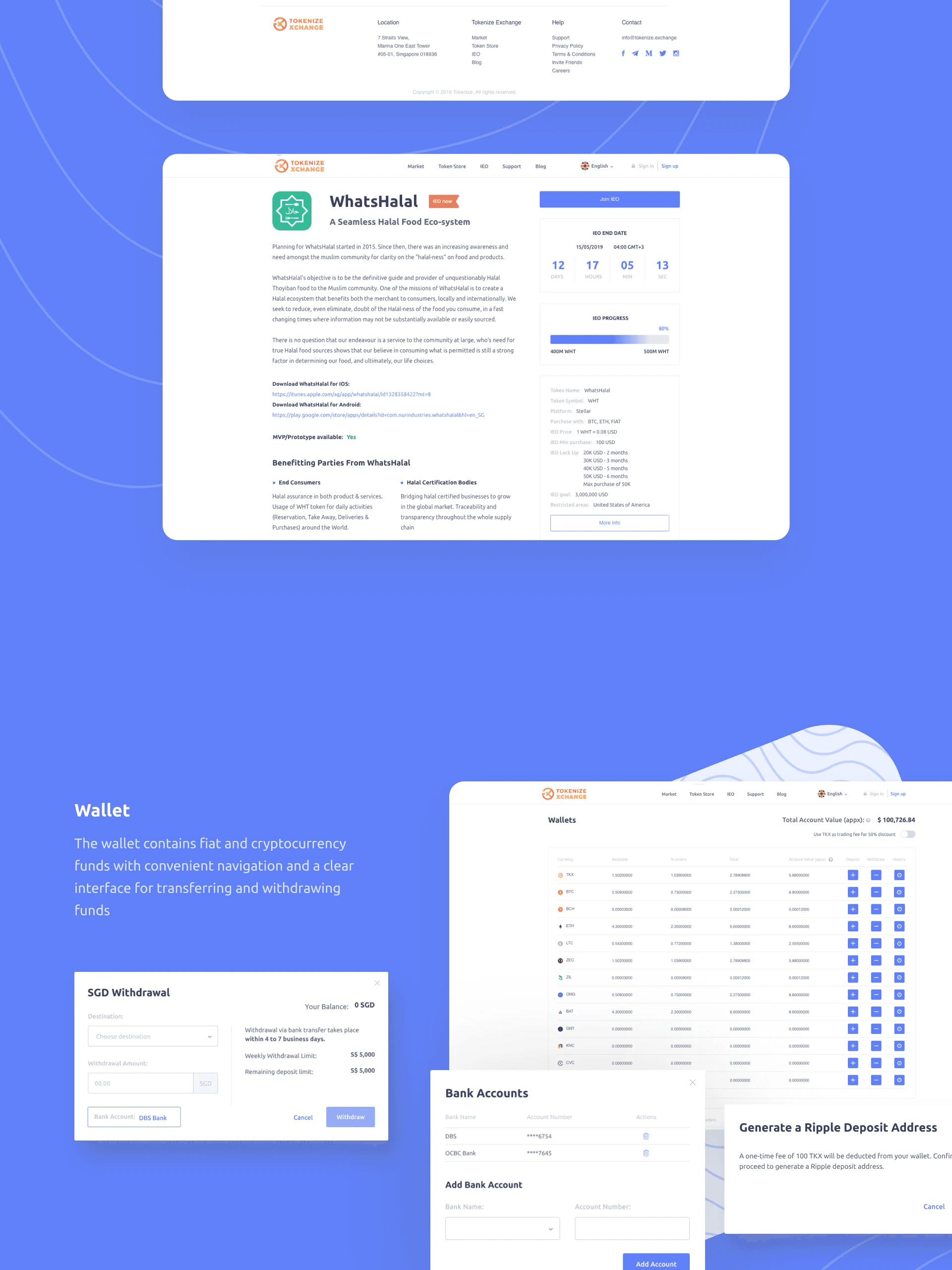
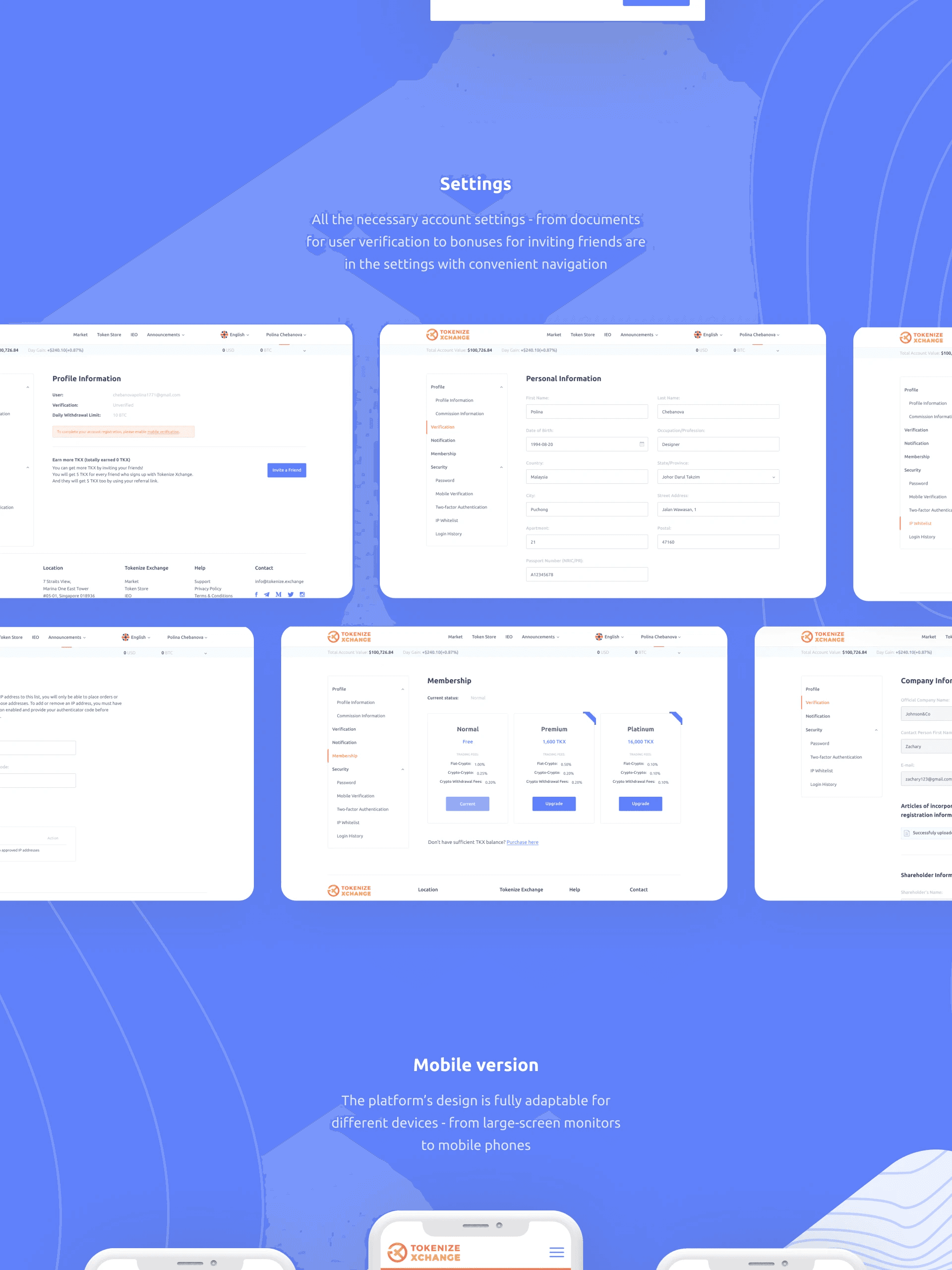
One coherent journey from landing page to portfolio
The redesign treated the platform as an end-to-end user journey, not a collection of disconnected screens:
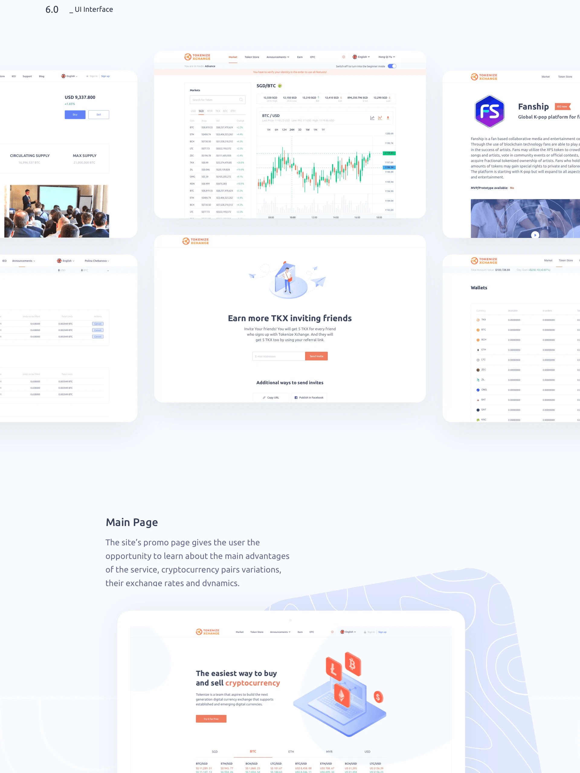
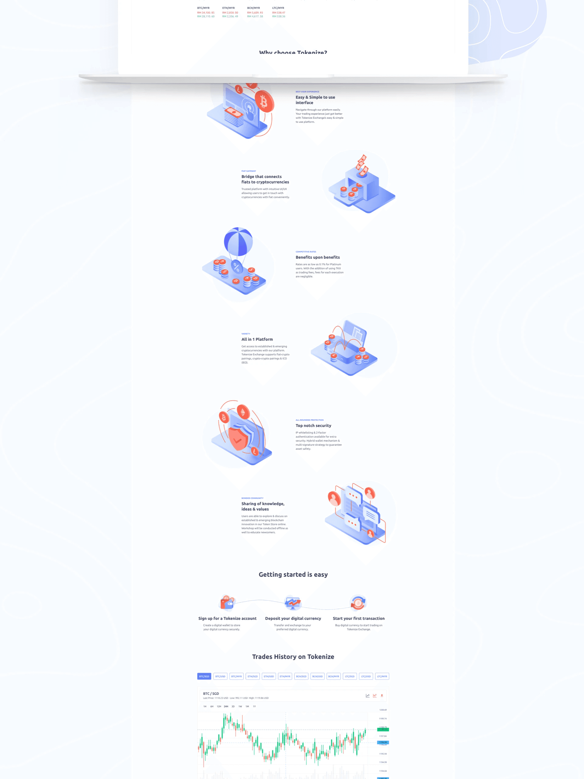
Landing page: Rewritten to communicate Tokenize's value proposition clearly — regulated, secure, Singapore-based — with a direct path to sign-up
Onboarding: Step-by-step account setup with progress indicators and plain-language explanations of KYC requirements — reducing anxiety at the most drop-off-prone moment
Dashboard: Personalized summary of balances, recent activity, and market updates — giving users immediate orientation when they log in
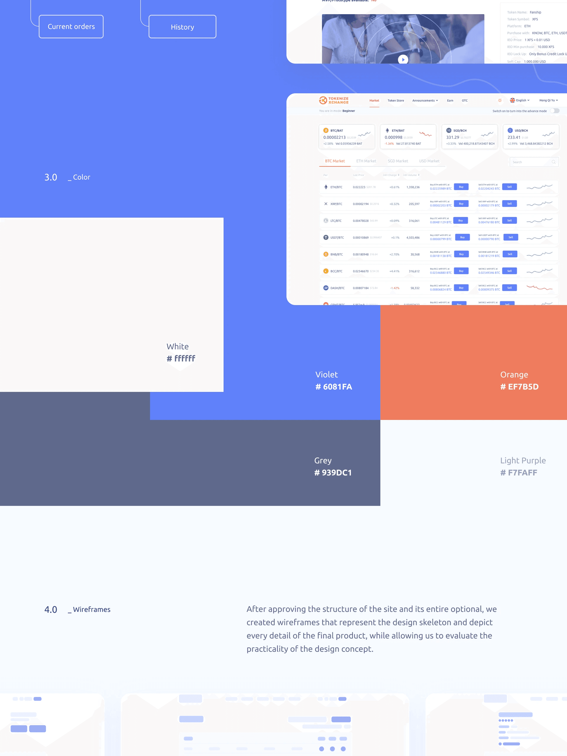
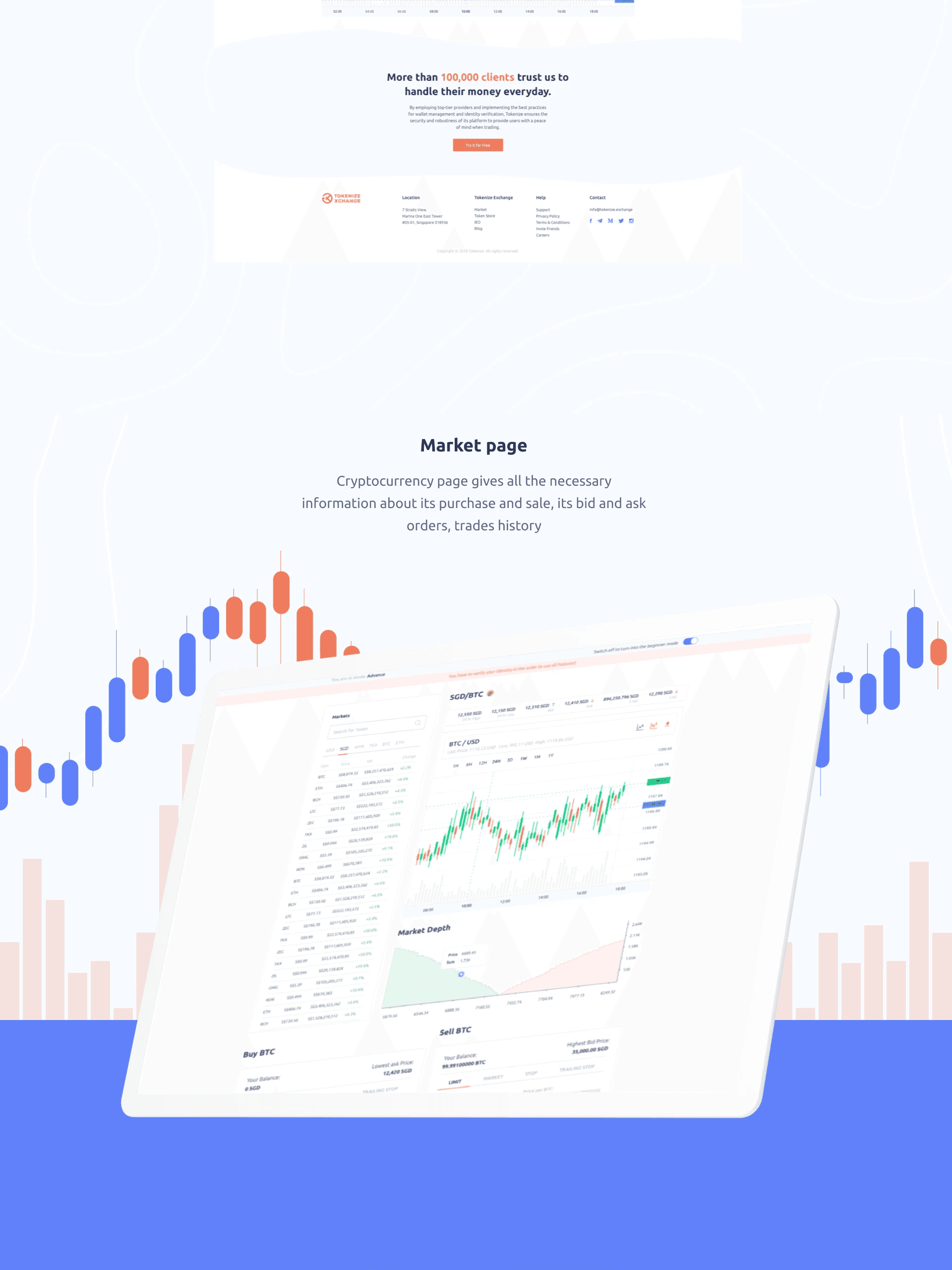
Trading view: Simplified default with customizable charts and indicators — expert tools visible but not dominant
Portfolio: Asset performance and risk overview in a scannable format — connected to the dashboard to make the app feel coherent
Education layer: Contextual tooltips and a dedicated learning section embedded directly into the product — reducing support dependency and improving user confidence
(Results & Impact)
✅ Usability testing showed users completed core tasks (finding balance, placing a trade, reviewing order history) significantly faster after the redesign
✅ Post-test interviews reported higher satisfaction and lower perceived complexity — users described the redesigned platform as 'cleaner' and 'easier to learn'
✅ The improved onboarding flow reduced confusion at the KYC and account setup stage — fewer incomplete sign-ups
✅ The education layer reduced the category of support queries related to 'how do I' questions — users found answers in-product

(Next Step)
The web platform redesign exposed a second major opportunity: the mobile experience was even more problematic for time-sensitive trading decisions. This led directly to the Tokenize Exchange Mobile project — a focused redesign of the buy/sell flow for mobile-first traders under market pressure.

