
(Sep, 2019)
(Summary)
Crypto trading on mobile is uniquely high-risk: users are making real financial decisions on a small screen, under time pressure, during market volatility. The Tokenize mobile trade flow was causing users to drop off before completing trades and make costly errors from mis-taps and unclear confirmations. I redesigned the end-to-end buy/sell execution flow — from market selection to order confirmation — around three principles: reduce cognitive load, prevent errors before they happen, and give users confidence in what they're about to do.

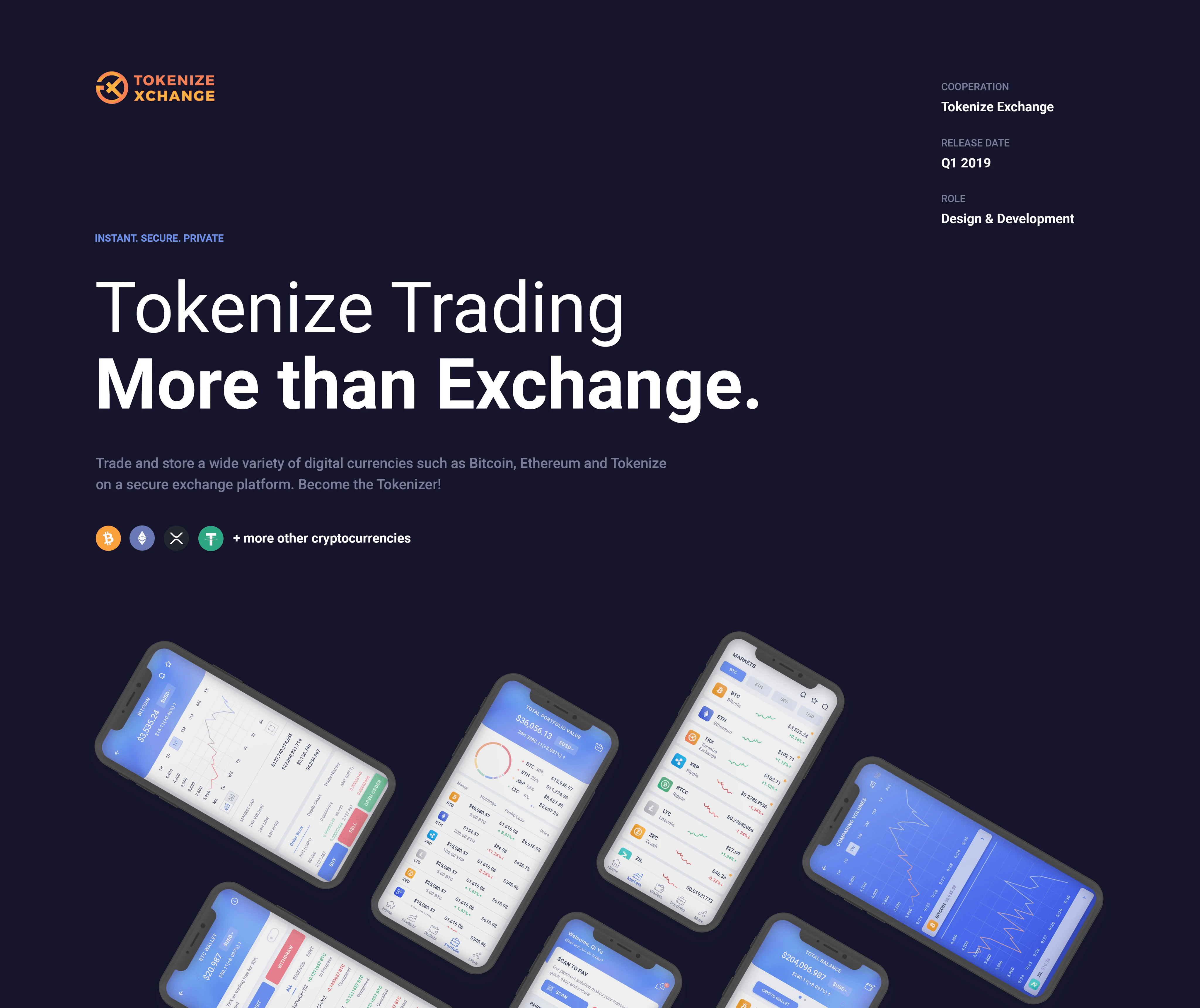
Tokenize Technology Pte. Ltd.
Singapore
Tokenize Technology Pte. Ltd. is a Singapore-based fintech company operating Tokenize Exchange, a regulated digital asset trading platform.
(Problem Framing)
Real money. Small screen. High pressure. Bad design.
Mobile trading creates a perfect storm of friction: screens are small, fingers are imprecise, and the cost of a mistake is real and immediate. Users were experiencing two core failure modes:
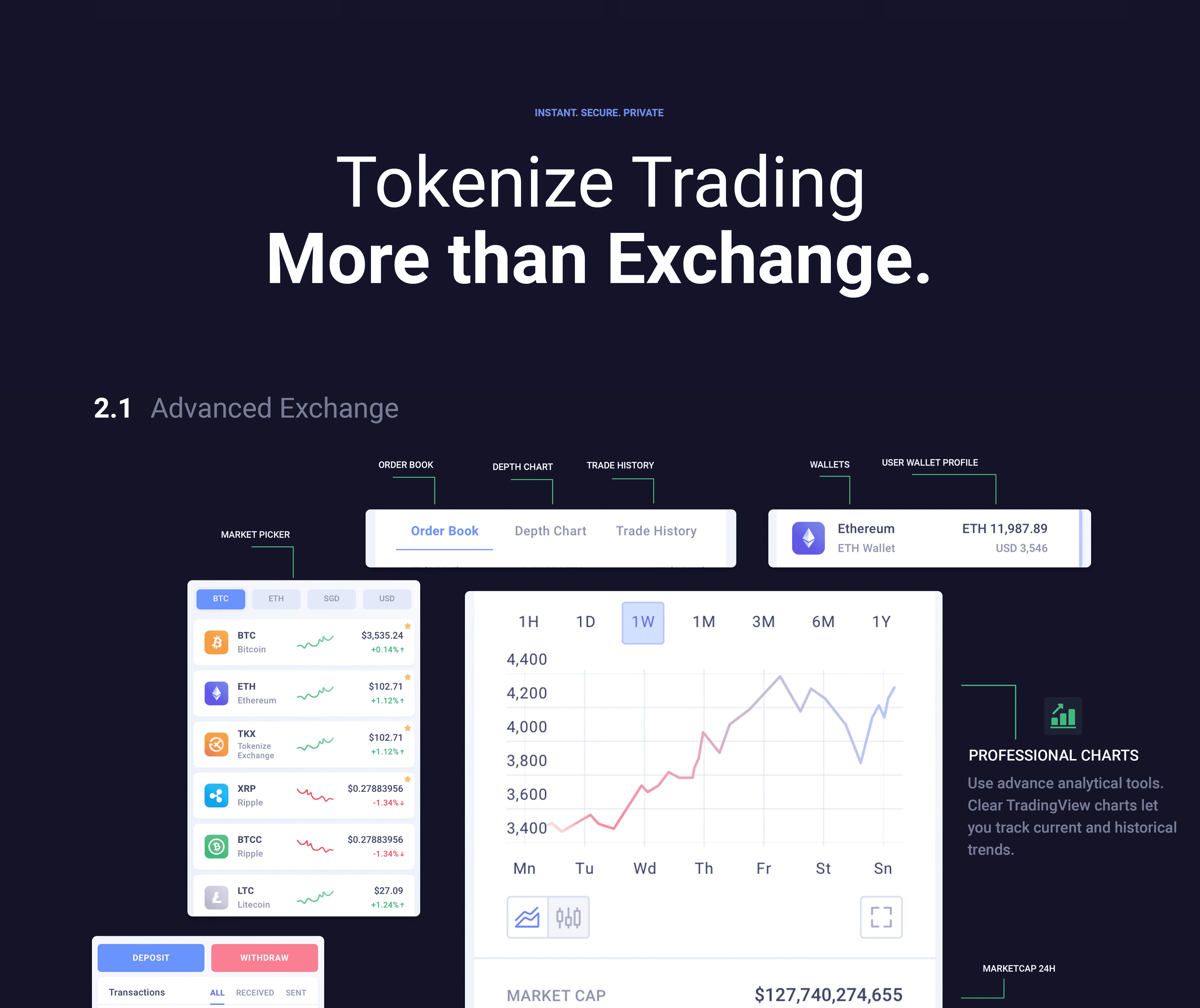
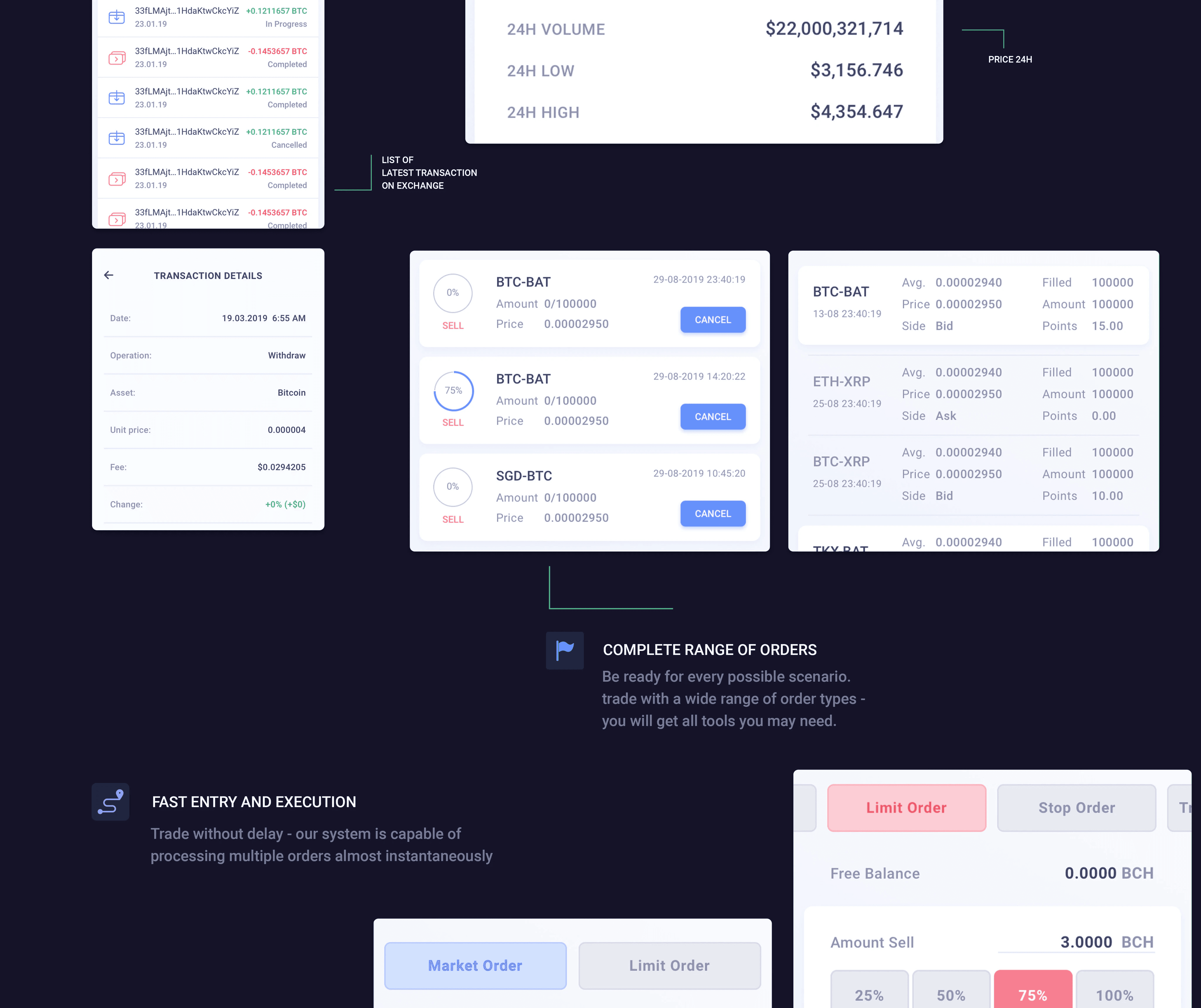
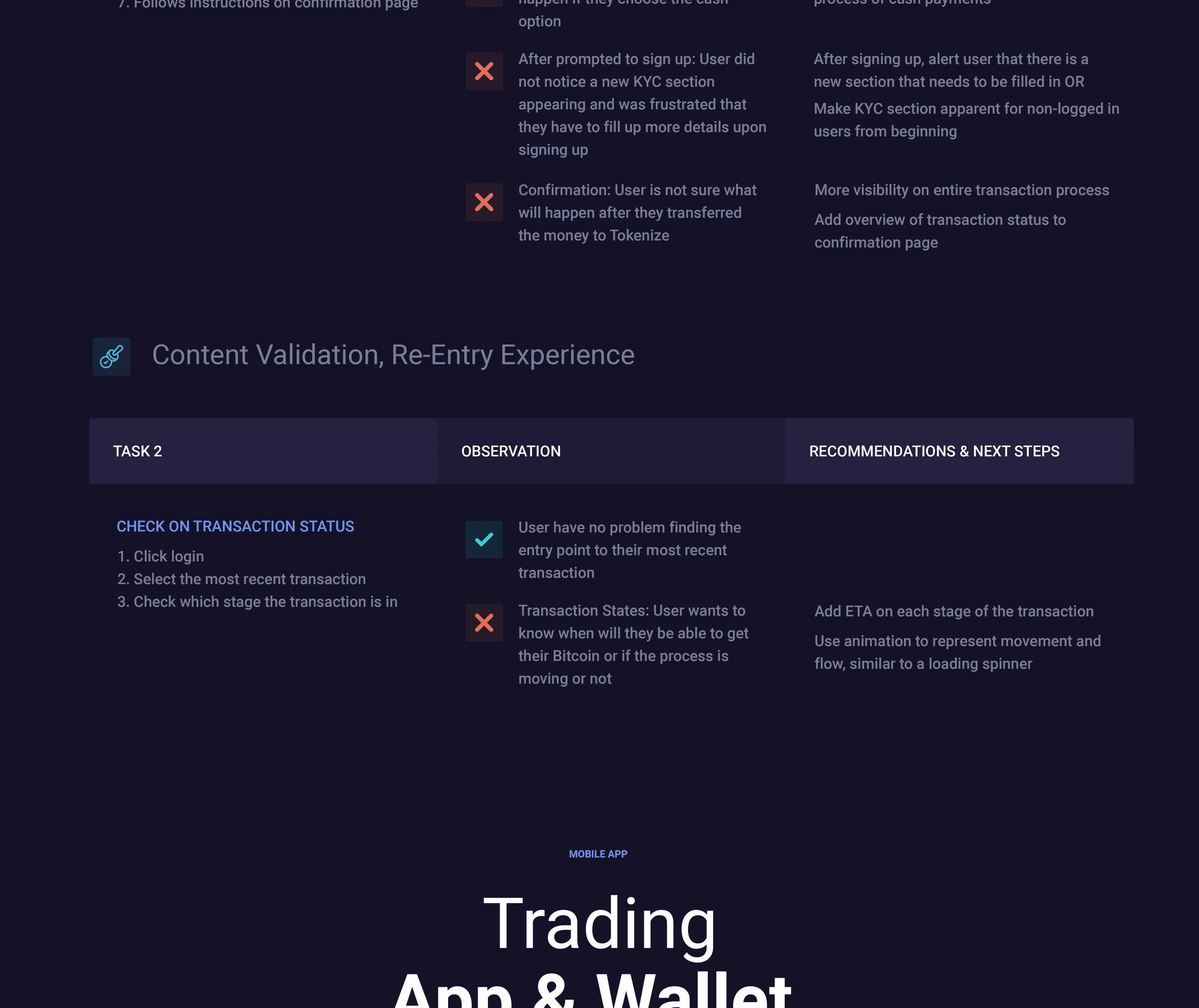
Trade drop-off — users started a trade but abandoned before confirming. They couldn't quickly verify the key details they needed (pair, price, fees, available balance) without scrolling through a dense, unorganized interface
Costly mis-taps — users were executing unintended trades because the confirmation step didn't surface enough information to catch errors before they became orders
Both problems got worse during market volatility — exactly the moments when users most needed the interface to work.
(Role & Team)
What I owned
I was the sole designer on this focused redesign, working closely with the mobile engineering team. The scope was deliberately narrow: the buy/sell execution flow, from market selection to order status confirmation. This focus allowed for deep iteration rather than surface-level improvements across many screens.

(Approach)
Map the failure moments, then design backwards from them
I started by mapping the exact points in the existing flow where users dropped off or made errors — treating the trade flow as a funnel and identifying where friction was highest. Three failure moments emerged:
Input stage: Too many fields presented simultaneously, with no clear sequence — users weren't sure which order to fill things in
Review stage: No dedicated moment to see the full order summary before confirming — users had to hold key details in their head while scrolling
Confirmation: A single 'Confirm' button with no context around what was being confirmed — too easy to tap accidentally, too easy to miss if hesitant
I then ran concept testing with representative users on wireframe prototypes to validate that my proposed solutions actually resolved these failure moments before building high-fidelity designs.
(Challenges)
Speed vs. safety — the eternal mobile trading tension
Expert traders hate friction. Every extra step, every confirmation screen, every validation message is a cost — especially in a fast-moving market. But for less experienced users, those same steps are safety nets they can't trade without.
The design challenge was finding the minimum friction needed for safety without adding so much that expert users felt slowed down. The solution was to front-load information display (so users had everything they needed without extra taps) while keeping the actual execution path short and direct.
(Solutions)
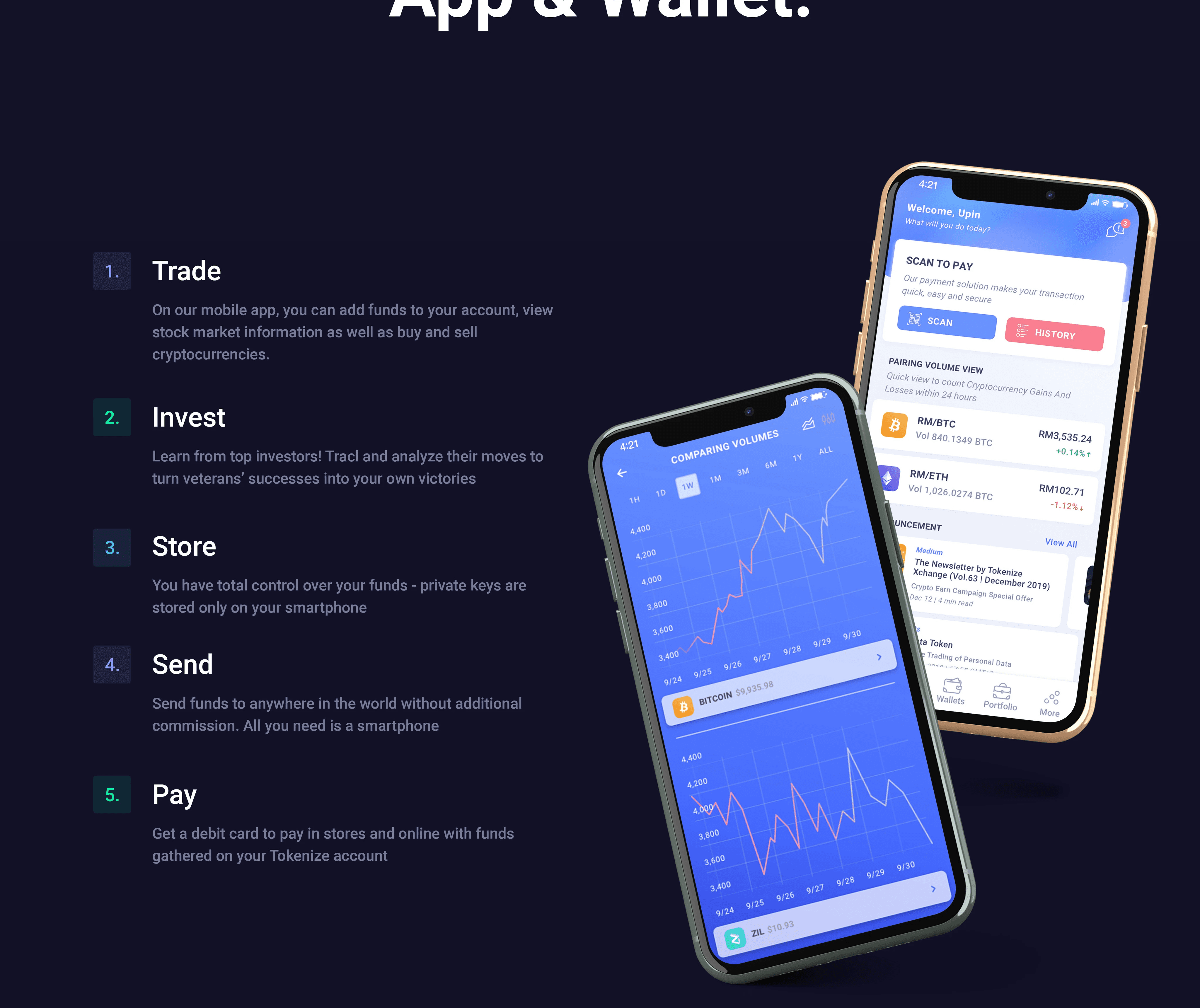
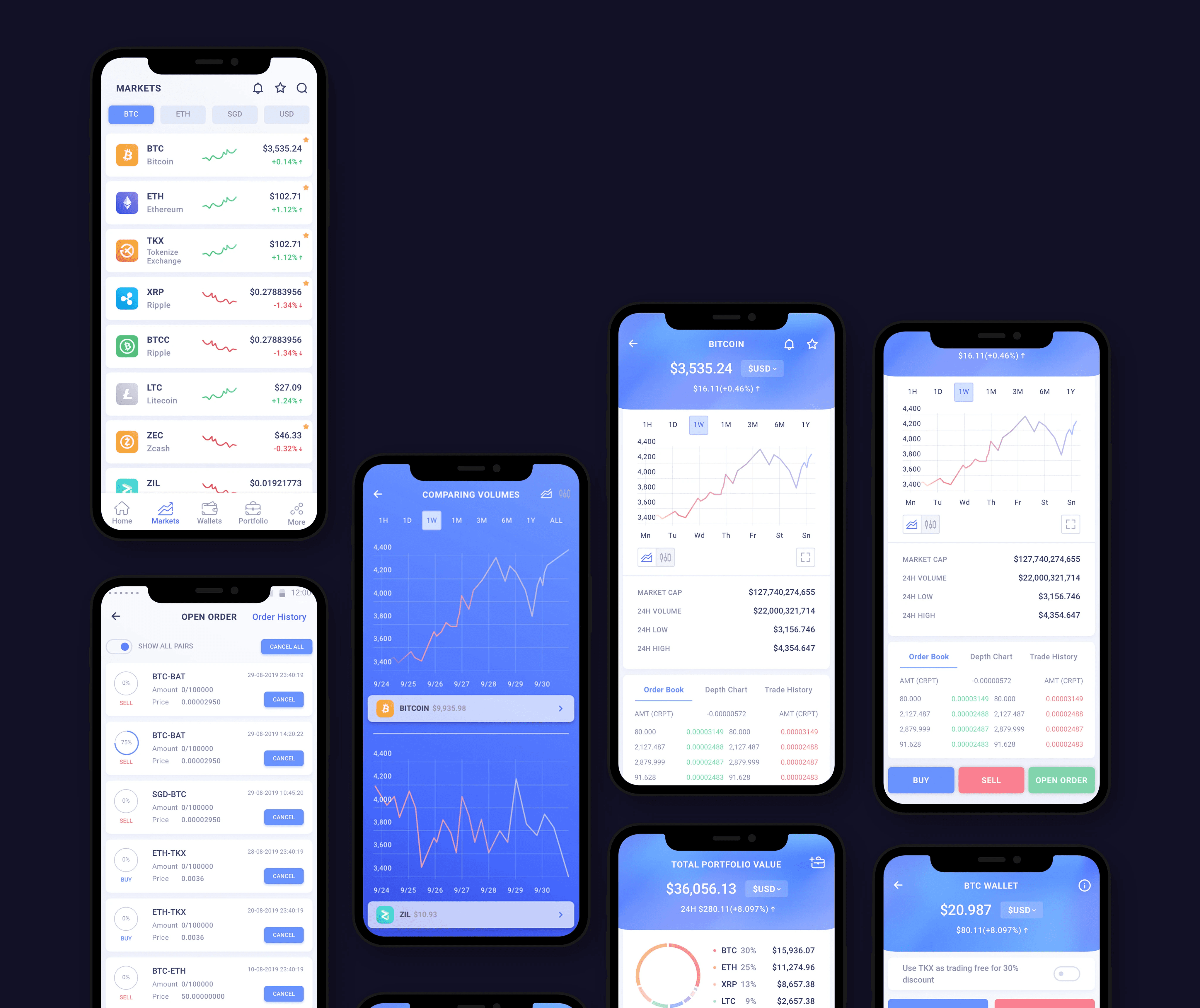
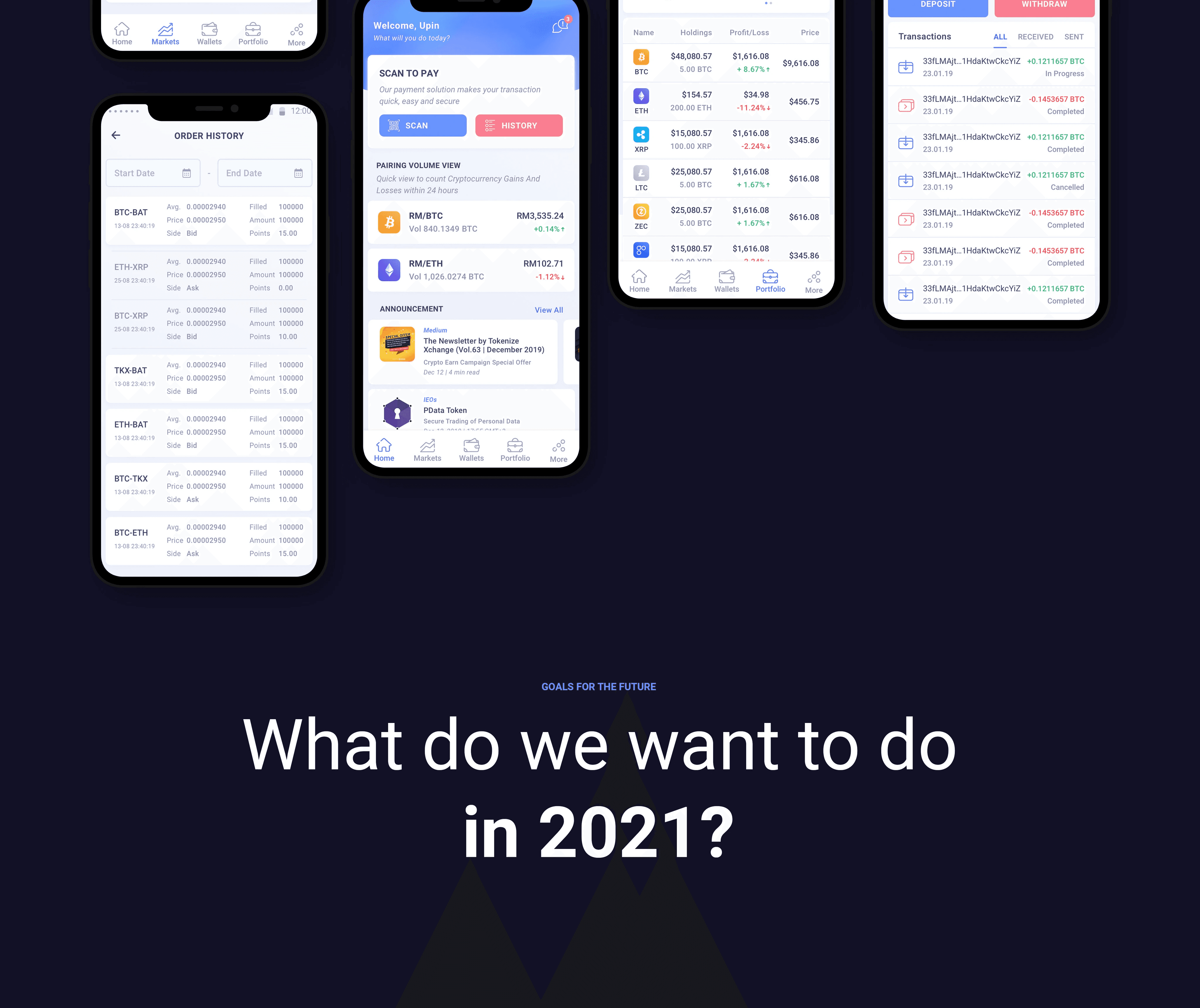
One clear job per step. Everything you need before you commit.
Restructured order flow into a linear sequence with one job per step: market selection → order type → amount & price → review → confirm. No branching, no ambiguity about what to do next
Dedicated review screen: Before any order is placed, users see a complete summary — trading pair, order type, estimated execution price, fees, and available balance — all visible without scrolling. This is the 'does this look right?' moment the original flow was missing
Real-time validation: Balance warnings, minimum order alerts, and fee estimates appeared as users typed — not after they submitted. Errors were caught at input, not at confirmation
Explicit confirmation interaction: The final confirm action required a deliberate, clearly labeled tap on a button that named the specific action — 'Buy 0.5 ETH' not just 'Confirm'. Reduced accidental execution and gave hesitant users a clear exit
(Results & Impact)
✅ Trade drop-off at the confirmation stage decreased — users who reached the review screen completed their trades at a higher rate
✅ Error-related support queries about incorrect order types, unexpected fees, and wrong trading pairs decreased after launch
✅ Post-launch feedback from users noted the flow felt 'faster' despite the added review step — because less time was spent scanning for information they couldn't find
✅ The linear flow structure was later adopted as a pattern for other transaction types on the mobile platform

(Next Step)
The trade flow redesign proved that focused, flow-specific interventions can have a disproportionate impact on user outcomes — especially in high-stakes financial products. The next opportunity identified was the portfolio and alerts experience: giving users better mobile tools for monitoring positions and setting price alerts, so they could make trade decisions proactively rather than reactively.
